

Здравствуйте, давайте рассмотрим самые современные способы заливки текста, которые существуют на данный момент в сайтостроении. Если вам трудно будет разобраться и прикрутить код данных методов к своему сайту, то рекомендую веб.
1. Заливка текста при помощи CSS
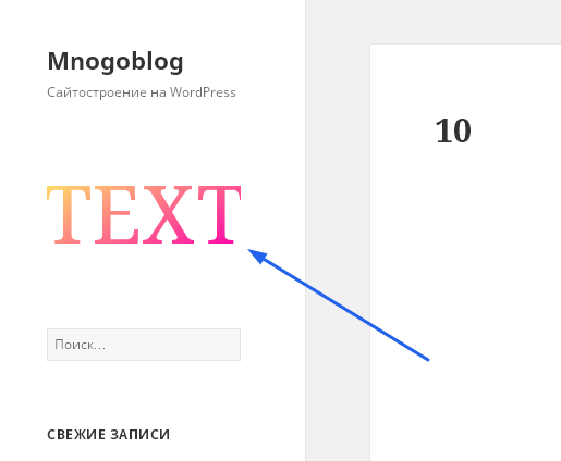
1.1. Вставляем в текст фоновую картинку:

HTML код:
<div class="box-with-text">
    Text
</div>
При создании сайта на wordpress и тестировании кода – “HTML код” можно вставить в текстовой виджет (виджет “Текст”), для этого переходим в админку wordpress, в пункт “Внешний вид”, подпункт “Виджеты”, выбираем виджет “Текст”, перетаскиваем его в сайдбар и вставляем в него код.
CSS код:
.box-with-text {
  background-image: url("/wp-content/uploads/2016/09/image1.jpg");
  -webkit-text-fill-color: transparent;
  -webkit-background-clip: text; }

.box-with-text {
  overflow: hidden;
  background-position: 50% 50%;
  background-size: cover;
  white-space: nowrap;
  text-align: center;
  text-transform: uppercase;
  font-size: 60px;
  font-weight: 800;
  margin: 0 0 100px; }
При создании сайта на wordpress и тестировании кода – “CSS код” вставляется в файл стилей – style.css – для этого переходим в админку wordpress, выбираем пункт “Внешний вид”, подпункт “Редактор”, по умолчанию открывается файл стилей – style.css – в него и нужно вставить код.
1.2. Вставляем в текст анимированную фоновую картинку при помощи CSS:
HTML код:
<div class="box-with-text">
    Text
</div>
CSS код:
.box-with-text {
  background-image: -webkit-linear-gradient(crimson 50%, white 50%);
  background-position: 0 0;
  -webkit-background-clip: text;
  background-size: 100% 10px;
  background-repeat: repeat;
  -webkit-animation: stripes 10s linear infinite;
  animation: stripes 10s linear infinite;
  -webkit-text-fill-color: transparent; }

@-webkit-keyframes stripes {
  100% {
    background-position: 0 -50px; } }
@keyframes stripes {
  100% {
    background-position: 0 -50px; } }

.box-with-text {
  text-align: center;
  overflow: hidden;
  text-transform: uppercase;
  white-space: nowrap;
  font-size: 60px;
  font-weight: 800;
  margin-bottom: 100px; }
2. Заливка текста при помощи SVG
2.1. Обычная градиентная заливка текста:
HTML код:
<svg viewBox="0 0 600 300">

<linearGradient id="gr-simple" x1="0" y1="0" x2="100%" y2="100%">
    <stop stop-color="hsl(50, 100%, 70%)" offset="10%"/>
    <stop stop-color="hsl(320, 100%, 50%)" offset="90%"/>
</linearGradient>

  <text text-anchor="middle"
          x="50%"
          y="50%"
          dy=".35em"
          class="text"
          >
      Text
    </text>
</svg>
CSS код:
.text {
  text-transform: uppercase;
  fill: url("#gr-simple");
  font-size: 250px;
 }

svg {
  width: 100%;
  margin: 0 auto 50px;
  display: block;
  text-transform: uppercase; }
2.2. Заливка текста радиальным градиентом с анимацией:
HTML код:
<svg viewBox="0 0 600 300">

  <!-- Gradient -->
  <radialGradient id="gr-radial"
                  cx="50%" cy="50%" r="70%"
                  >
    <!-- Animation for radius of gradient -->
    <animate attributeName="r"
             values="0%;150%;100%;0%"
             dur="5s" repeatCount="indefinite" />
    <!-- Animation for colors of stop-color -->
    <stop stop-color="#FFF" offset="0">
      <animate attributeName="stop-color"
               values="#333;#FFF;#FFF;#333"
               dur="5s" repeatCount="indefinite" />
    </stop>
    <stop stop-color="rgba(55,55,55,0)" offset="100%"/>
  </radialGradient>

  <!-- Text -->
  <text text-anchor="middle"
        x="50%"
        y="50%"
        dy=".35em"
        class="text"
        >
    Text
  </text>
</svg>
CSS код:
.text {
  fill: url(#gr-radial);
  font-size: 250px;
}

svg {
  width: 100%;
  margin: 0 auto 50px;
  display: block;
  text-transform: uppercase;
}
2.3. Заливка текста с использование паттерна:
HTML код:
<svg viewBox="0 0 600 300">

					<!-- Pattern -->
					<pattern
					       id="p-stars"
					       width="70"
					       height="70"
					       viewBox="0 0 120 120"
					       patternUnits="userSpaceOnUse"
					       >

					<g class="g-stars">
					<polygon
					 points="15 22.5 6.18322122 27.1352549 7.86707613 17.3176275 0.734152256 10.3647451 10.5916106 8.93237254 15 0 19.4083894 8.93237254 29.2658477 10.3647451 22.1329239 17.3176275 23.8167788 27.1352549 "
					 transform="
					   scale(.9,.9)"
					 ></polygon>

					<polygon
					 points="15 22.5 6.18322122 27.1352549 7.86707613 17.3176275 0.734152256 10.3647451 10.5916106 8.93237254 15 0 19.4083894 8.93237254 29.2658477 10.3647451 22.1329239 17.3176275 23.8167788 27.1352549"
					 transform="
					   translate(30,30)
					   scale(.9,.9)
					   "
					 ></polygon>

					<polygon
					 points="15 22.5 6.18322122 27.1352549 7.86707613 17.3176275 0.734152256 10.3647451 10.5916106 8.93237254 15 0 19.4083894 8.93237254 29.2658477 10.3647451 22.1329239 17.3176275 23.8167788 27.1352549"
					 transform="
					   translate(90,30)
					   scale(.9,.9)
					   "
					 ></polygon>

					<polygon
					 points="15 22.5 6.18322122 27.1352549 7.86707613 17.3176275 0.734152256 10.3647451 10.5916106 8.93237254 15 0 19.4083894 8.93237254 29.2658477 10.3647451 22.1329239 17.3176275 23.8167788 27.1352549"
					 transform="
					   translate(0,60)
					   scale(.9,.9)"
					 ></polygon>

					<polygon
					 points="15 22.5 6.18322122 27.1352549 7.86707613 17.3176275 0.734152256 10.3647451 10.5916106 8.93237254 15 0 19.4083894 8.93237254 29.2658477 10.3647451 22.1329239 17.3176275 23.8167788 27.1352549 "
					 transform="
					   translate(60,0)
					   scale(.9,.9)
					   "
					 ></polygon>

					<polygon
					 points="15 22.5 6.18322122 27.1352549 7.86707613 17.3176275 0.734152256 10.3647451 10.5916106 8.93237254 15 0 19.4083894 8.93237254 29.2658477 10.3647451 22.1329239 17.3176275 23.8167788 27.1352549"
					 transform="
					   translate(60,60)
					   scale(.9,.9)
					   "
					 ></polygon>

					<polygon
					 points="15 22.5 6.18322122 27.1352549 7.86707613 17.3176275 0.734152256 10.3647451 10.5916106 8.93237254 15 0 19.4083894 8.93237254 29.2658477 10.3647451 22.1329239 17.3176275 23.8167788 27.1352549"
					 transform="
					   translate(90,90)
					   scale(.9,.9)
					   "
					 ></polygon>

					<polygon
					 points="15 22.5 6.18322122 27.1352549 7.86707613 17.3176275 0.734152256 10.3647451 10.5916106 8.93237254 15 0 19.4083894 8.93237254 29.2658477 10.3647451 22.1329239 17.3176275 23.8167788 27.1352549"
					 transform="
					   translate(30,90)
					   scale(.9,.9)
					   "
					 ></polygon>


					 <polygon
					 points="15 22.5 6.18322122 27.1352549 7.86707613 17.3176275 0.734152256 10.3647451 10.5916106 8.93237254 15 0 19.4083894 8.93237254 29.2658477 10.3647451 22.1329239 17.3176275 23.8167788 27.1352549"
					 transform="
					   translate(120,60)
					   scale(.9,.9)
					   "
					 ></polygon>

					 <polygon
					 points="15 22.5 6.18322122 27.1352549 7.86707613 17.3176275 0.734152256 10.3647451 10.5916106 8.93237254 15 0 19.4083894 8.93237254 29.2658477 10.3647451 22.1329239 17.3176275 23.8167788 27.1352549"
					 transform="
					   translate(60,120)
					   scale(.9,.9)
					   "
					 ></polygon>

					 <polygon
					 points="15 22.5 6.18322122 27.1352549 7.86707613 17.3176275 0.734152256 10.3647451 10.5916106 8.93237254 15 0 19.4083894 8.93237254 29.2658477 10.3647451 22.1329239 17.3176275 23.8167788 27.1352549"
					 transform="
					   translate(0,120)
					   scale(.9,.9)
					   "
					 ></polygon>

					 <polygon
					 points="15 22.5 6.18322122 27.1352549 7.86707613 17.3176275 0.734152256 10.3647451 10.5916106 8.93237254 15 0 19.4083894 8.93237254 29.2658477 10.3647451 22.1329239 17.3176275 23.8167788 27.1352549"
					 transform="
					   translate(-30,90)
					   scale(.9,.9)
					   "
					 ></polygon>

					 <!-- Hack to make shapes full  -->
					 <polygon></polygon>
					 <polygon></polygon>
					 <polygon></polygon>

					 <polygon
					 points="15 22.5 6.18322122 27.1352549 7.86707613 17.3176275 0.734152256 10.3647451 10.5916106 8.93237254 15 0 19.4083894 8.93237254 29.2658477 10.3647451 22.1329239 17.3176275 23.8167788 27.1352549"
					 transform="
					   translate(120,0)
					   scale(.9,.9)
					   "
					 ></polygon>

					</g>

					</pattern>

					<!-- Text -->
					<text text-anchor="middle"
					      x="50%"
					      y="50%"
					      dy=".35em"
					      class="text"
					      >
					  Text
					</text>

				</svg>
CSS код:
.text {
  fill: url("#p-stars");
  stroke: #551f7a;
  stroke-width: 3;
font-size: 200px;
  font-weight: 800; }

/* Colorize & animate pattern */
.g-stars polygon {
  stroke-width: 0;
  -webkit-animation: stroke 2s infinite;
  animation: stroke 2s infinite; }
  .g-stars polygon:nth-child(5n + 1) {
    fill: #551F7A;
    stroke: #551F7A;
    -webkit-animation-delay: -0.4s;
    animation-delay: -0.4s; }
  .g-stars polygon:nth-child(5n + 2) {
    fill: #BA2799;
    stroke: #BA2799;
    -webkit-animation-delay: -0.8s;
    animation-delay: -0.8s; }
  .g-stars polygon:nth-child(5n + 3) {
    fill: #D9587A;
    stroke: #D9587A;
    -webkit-animation-delay: -1.2s;
    animation-delay: -1.2s; }
  .g-stars polygon:nth-child(5n + 4) {
    fill: #FFDD00;
    stroke: #FFDD00;
    -webkit-animation-delay: -1.6s;
    animation-delay: -1.6s; }
  .g-stars polygon:nth-child(5n + 5) {
    fill: #fff3a1;
    stroke: #fff3a1;
    -webkit-animation-delay: -2s;
    animation-delay: -2s; }

/* Change stroke-width within animation */
@-webkit-keyframes stroke {
  50% {
    stroke-width: 8; } }
@keyframes stroke {
  50% {
    stroke-width: 8; } }


svg {
  width: 100%;
  margin: 0 auto 50px;
  display: block;
  text-transform: uppercase; }
Так как статья получается большой, то продолжу в следующей.