

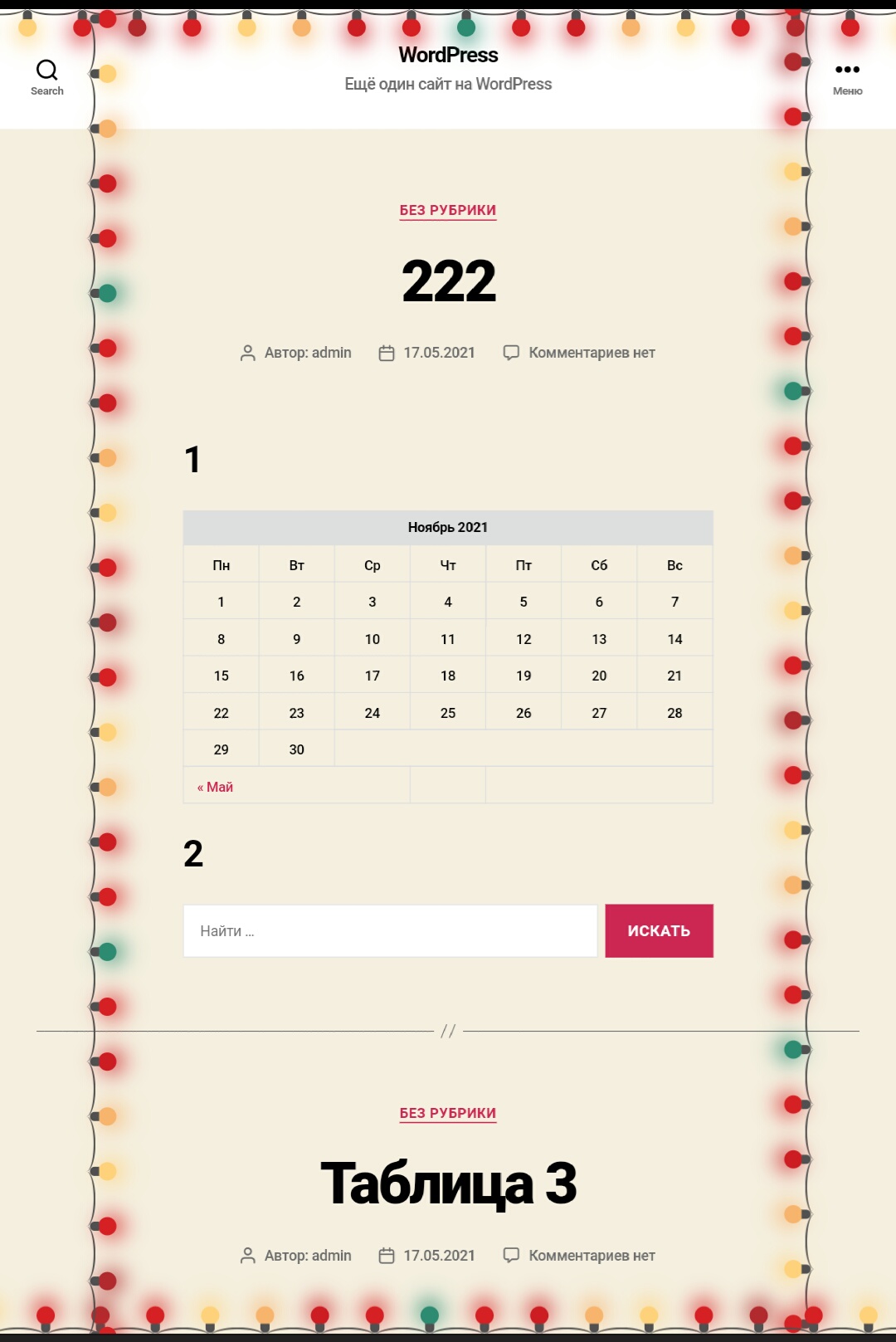
Здравствуйте, вот код красивой гирлянды на CSS и JS, которач украсит странички вашего сайта по периметру:
Скачать исходники для статьи можно ниже
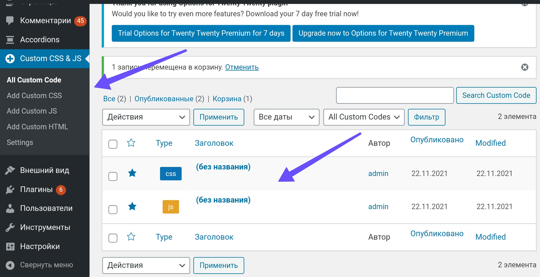
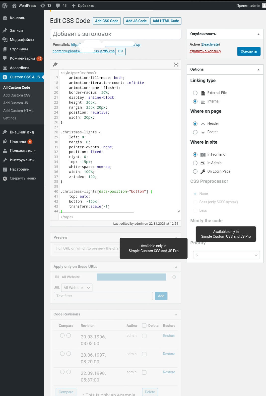
Для установки нижеуказанного кода можно воспользоваться бесплатным wordpress плагином:Simple Custom CSS and JS
Сведения о плагине на момент публикации статьи:
Активных установок: 400,000+
Автор: SilkyPress.com
Сайт плагина: “ru.wordpress.org/plugins/custom-css-js/”
Установка стандартная через панель управления wordpress.
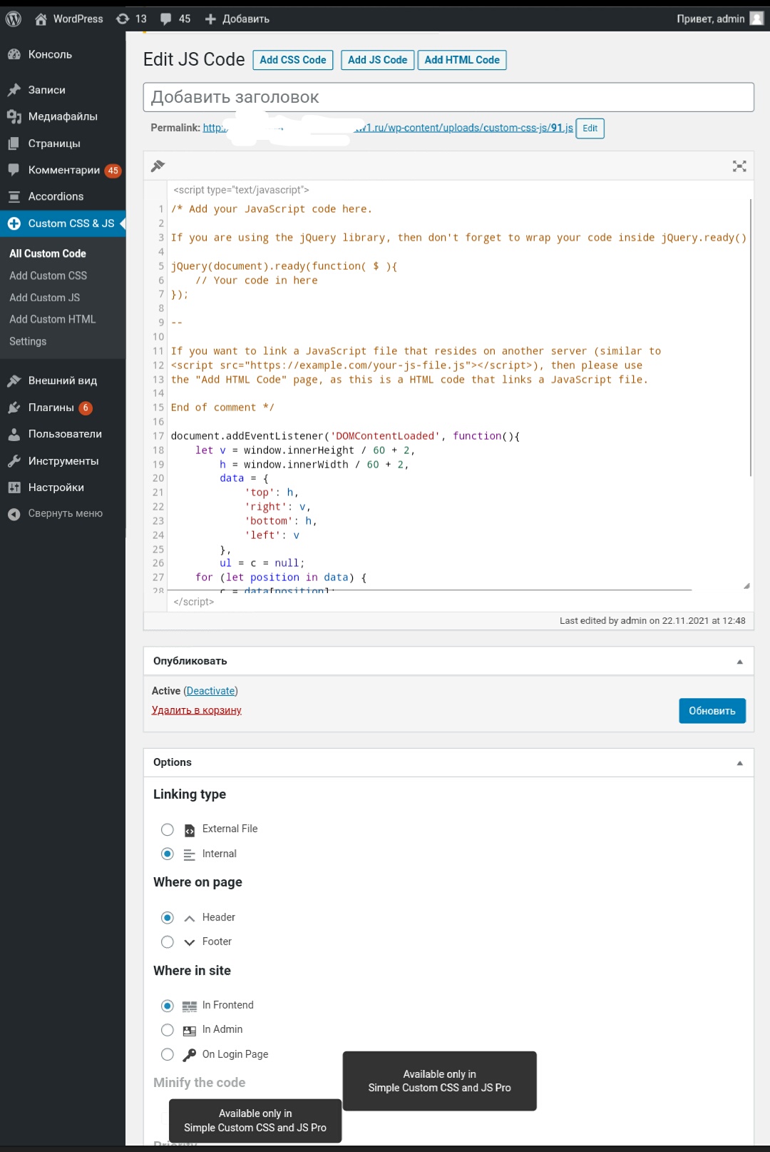
Код JS:
document.addEventListener('DOMContentLoaded', function(){
    let v = window.innerHeight / 60 + 2,
        h = window.innerWidth / 60 + 2,
        data = {
            'top': h,
            'right': v,
            'bottom': h,
            'left': v
        },
        ul = c = null;
    for (let position in data) {
        c = data[position];
        ul = document.createElement('ul');
        ul.className = 'christmas-lights';
        ul.dataset.position = position;
        for (let i = 0; i <= c; i++) {
            ul.append(document.createElement('li'));
        }
        document.body.append(ul);
    }
});
Код CSS:
.christmas-lights li {
    --christmas-lights-1: #057d70; /*color - 1*/
    --christmas-lights-2: #d41a21; /*color - 2*/
    --christmas-lights-3: #ffd27c; /*color - 3*/
    animation-duration: 2s;
    animation-fill-mode: both;
    animation-iteration-count: infinite;
    animation-name: flash-1;
    border-radius: 50%;
    display: inline-block;
    height: 20px;
    margin: 25px 20px;
    position: relative;
    width: 20px;
}

.christmas-lights {
    left: 0;
    margin: 0;
    pointer-events: none;
    position: fixed;
    right: 0;
    top: -15px;
    white-space: nowrap;
    width: 100%;
    z-index: 100;
}

.christmas-lights[data-position="bottom"] {
    top: auto;
    bottom: -15px;
    transform:scale(-1)
}

.christmas-lights[data-position="right"],
.christmas-lights[data-position="left"] {
    transform: rotate(-90deg);
    left: -10px;
    top: 0;
    right: auto;
    bottom: 0;
    width: 100vh;
}

.christmas-lights[data-position="right"] {
    transform: rotate(90deg);
    left: auto;
    right: -15px;
}

.christmas-lights li:before {
    content: "";
    position: absolute;
    background: #505050;
    width: 10px;
    height: 10px;
    border-top-left-radius: 5px;
    border-top-right-radius: 5px;
    top: -9px;
    left: 5px;
}

.christmas-lights li:after {
    content: "";
    top: -23px;
    left: 10px;
    position: absolute;
    width: 60px;
    height: 20px;
    border-bottom: solid #505050 2px;
    border-radius: 50%;
}

.christmas-lights li:last-child:after {
    content: none;
}
.christmas-lights li:last-child:after {
    content: none;
}

.christmas-lights li:first-child {
    margin-left: -40px;
}

.christmas-lights li:nth-child(2n+1) {
    background: var(--christmas-lights-1);
    box-shadow: 0px 5px 24px 3px rgb(249 212 129);
    animation-name: flash-2;
    animation-duration: 0.4s;
}

.christmas-lights li:nth-child(4n+2) {
    background: var(--christmas-lights-2);
    box-shadow: 0px 5px 24px 3px var(--christmas-lights-2);
    animation-name: flash-3;
    animation-duration: 1.1s;
}

.christmas-lights li:nth-child(odd) {
    animation-duration: 1.8s;
}

.christmas-lights li:nth-child(3n+1) {
      animation-duration: 1.4s;
}

@keyframes flash-1 {
    0%, 100% {
        background: var(--christmas-lights-1);
        box-shadow: 0px 5px 24px 3px var(--christmas-lights-1);
    }
    50% {
        background: var(--christmas-lights-2);
        box-shadow: 0px 5px 24px 3px var(--christmas-lights-2);
    }
}

@keyframes flash-2 {
    0%, 100% {
        background: var(--christmas-lights-2);
        box-shadow: 0px 5px 24px 3px var(--christmas-lights-2);
    }
    50% {
        background: var(--christmas-lights-3);
        box-shadow: 0px 5px 24px 3px var(--christmas-lights-3);
    }
}

@keyframes flash-3 {
    0%, 100% {
        background: var(--christmas-lights-3);
        box-shadow: 0px 5px 24px 3px var(--christmas-lights-3);
    }
    50% {
        background: var(--christmas-lights-1);
        box-shadow: 0px 5px 24px 3px var(--christmas-lights-1);
    }
}