


Здравствуйте, сегодня рассмотрим полезный ресурс от Google (позволяет создавать графики, диаграммы, гистограммы, графические схемы и др.), а также wordpress плагин, который помогает вставлять графики, диаграммы и др. с данного ресурса на wordpress сайт.
Скачать исходники для статьи можно ниже
Онлайн сервис от Google называется – Chart Gallery, он доступен по следующей ссылке:
“google-developers.appspot.com/chart/interactive/docs/gallery”
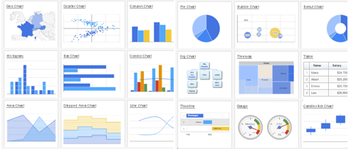
Что можно создать с помощью данного сервиса (у каждого вида есть еще дополнительные настройки, например создания 3D графиков и т.п.):
Плагин для вставки графиков и диаграмм на сайт wordpress называется GoogleGraph, сведения о плагине:
Последнее обновление: 2014-5-19
Загрузок: 197
Сайт плагина: “wordpress.org/plugins/googlegraph/”
У плагина GoogleGraph нет странички настроек, то есть после установки и активации плагина в вашей панели управления не появиться ничего – ни дополнительного подпункта, ни кнопочек. Для вставки графиков и диаграмм необходимо будет пользоваться шорткодами, о которых расскажу ниже:
Примеры создания графиков и диаграмм с помощью плагина GoogleGraph:
1. Гео графики
Код:
[geoChart width="700px" height="700px" ]
    ['Country', 'Popularity'],
    ['Germany', 200],
    ['United States', 300],
    ['Brazil', 400],
    ['Canada', 500],
    ['France', 600],
    ['RU', 700]
[/geoChart]
Еще пример
[geoChart width="700px" height="700px" displaymode="markers" region="MK"]
    ['City', 'Population', 'Area'],
    ['Skopje', 2761477, 1285.31],
    ['Bitola', 1324110, 181.76],
    ['Prilep', 959574, 117.27],
    ['Ohrid', 907563, 130.17],
    ['Shtip', 655875, 158.9],
    ['Gevgelija', 607906, 243.60],
    ['Resen', 380181, 140.7],
    ['Kriva Palanka', 371282, 102.41],
    ['Kavadarci', 67370, 213.44],
    ['Negotino', 52192, 43.43],
    ['Tetovo', 38262, 11]
[/geoChart]
И еще пример:
[geoChart width="700px" height="700px" colorstart="#e7711c" colorend="#4374e0"]
    ['Country', 'Popularity'],
    ['Germany', 200],
    ['United States', 300],
    ['Brazil', 400],
    ['Canada', 500],
    ['France', 600],
    ['RU', 700]
[/geoChart]
2. Линейный график
[lineChart width="600px" height="500px"
    legend="{ position: 'top', maxLines: 1 }"
    vaxis="{title: '$k', titleTextStyle: {color: 'black'}}"
    haxis="{title: 'Year', titleTextStyle: {color: 'black'}}" curvetype="none"]
        ['Year', 'Sales', 'Expenses'],
        ['2004',  1000,      400],
        ['2005',  1170,      460],
        ['2006',  660,       1120],
        ['2007',  1030,      540]
[/lineChart]
Еще пример:
[lineChart curvetype="function" width="600px" height="500px" stacked="1"
    legend="{ position: 'top', maxLines: 1 }"
    vaxis="{title: '$k', titleTextStyle: {color: 'black'}}"
    haxis="{title: 'Year', titleTextStyle: {color: 'black'}}"
    curvetype="function"]
        ['Year', 'Sales', 'Expenses'],
        ['2004',  1000,      400],
        ['2005',  1170,      460],
        ['2006',  660,  1120],
        ['2007',  1030,      540]
[/lineChart]
3. Столбиковые диаграммы (колонки)
[columnChart  width="500px"
    legend="{ position: 'top', maxLines: 2 }"
    vaxis="{title: 'in $000', titleTextStyle: {color: 'blue'}}"
    haxis="{title: 'Year', titleTextStyle: {color: 'blue'}}"]
        ['Year', 'Sales', 'Expenses'],
        ['2004', 1000, 400],
        ['2005', 1170, 460],
        ['2006', 660, 1120],
        ['2007', 1030, 540]
[/columnChart]
Еще пример:
[columnChart  width="300px" stacked="1"
    legend="{ position: 'top', maxLines: 2 }"
    vaxis="{title: 'in $000', titleTextStyle: {color: 'blue'}}"
    haxis="{title: 'Year', titleTextStyle: {color: 'blue'}}"]
        ['Year', 'Visitations', { role: 'style' } ],
        ['2010', 10, 'color: gray'],
        ['2010', 14, 'color: #76A7FA'],
        ['2020', 16, 'opacity: 0.2'],
        ['2040', 22, 'stroke-color: #703593; stroke-width: 4; fill-color: #C5A5CF'],
        ['2040', 28, 'stroke-color: #871B47; stroke-opacity: 0.6; stroke-width: 8; fill-color: #BC5679; fill-opacity: 0.2']
[/columnChart]
И еще пример:
[columnChart  width="500px" stacked="1"
    legend="{ position: 'top', maxLines: 2 }"
    vaxis="{title: 'in $M', titleTextStyle: {color: 'blue'}}"
    haxis="{title: 'Period', titleTextStyle: {color: 'blue'}}"]
        ['Genre', 'Fantasy & Sci Fi', 'Romance', 'Mystery/Crime', 'General','Western', 'Literature', { role: 'annotation' } ],
        ['2010', 10, 24, 20, 32, 18, 5, ''],
        ['2020', 16, 22, 23, 30, 16, 9, ''],
        ['2030', 28, 19, 29, 30, 12, 13, ''],
[/columnChart]
4. Бары
[barChart  width="500px" stacked="1"
    legend="{ position: 'top', maxLines: 2 }"
    vaxis="{title: 'in $000', titleTextStyle: {color: 'blue'}}"
    haxis="{title: 'Year', titleTextStyle: {color: 'blue'}}"]
        ['Year', 'Sales', 'Expenses'],
        ['2004', 1000, 400],
        ['2005', 1170, 460],
        ['2006', 660, 1120],
        ['2007', 1030, 540]
[/barChart]
Еще пример:
[barChart  width="500px" stacked="1"
    legend="{ position: 'top', maxLines: 2 }"
    vaxis="{title: 'in $000', titleTextStyle: {color: 'blue'}}"
    haxis="{title: 'Year', titleTextStyle: {color: 'blue'}}"]
        ['Year', 'Visitations', { role: 'style' } ],
        ['2010', 10, 'color: gray'],
        ['2010', 14, 'color: #76A7FA'],
        ['2020', 16, 'opacity: 0.2'],
        ['2040', 22, 'stroke-color: #703593; stroke-width: 4; fill-color: #C5A5CF'],
        ['2040', 28, 'stroke-color: #871B47; stroke-opacity: 0.6; stroke-width: 8; fill-color: #BC5679; fill-opacity: 0.2']
[/barChart]
И еще пример:
[barChart  width="500px" stacked="1"
    legend="{ position: 'top', maxLines: 2 }"
    vaxis="{title: 'in $M', titleTextStyle: {color: 'blue'}}"
    haxis="{title: 'Period', titleTextStyle: {color: 'blue'}}"]
        ['Genre', 'Fantasy & Sci Fi', 'Romance', 'Mystery/Crime', 'General','Western', 'Literature', { role: 'annotation' } ],
        ['2010', 10, 24, 20, 32, 18, 5, ''],
        ['2020', 16, 22, 23, 30, 16, 9, ''],
        ['2030', 28, 19, 29, 30, 12, 13, ''],
[/barChart]
5. Круговые диаграммы
[pieChart width="400px" ]
    ['Task', 'Hours per Day'],
    ['Work',     11],
    ['Eat',      2],
    ['Commute',  2],
    ['Watch TV', 2],
    ['Sleep',    7]
[/pieChart]